The Idea
With aims to cement Mandeville Conservatory of Music’s
foothold as a leading music academy, we refreshed the
Mandeville Conservatory of Music’s visual identity
and created a Mandeville junior sub-brand to distinguish
the parent brand (Mandeville Conservatory of Music)
from the junior brand (Mandeville Junior).
Mandeville Parent Brand. Their parent brand, was revived by taking elements from their earlier branding for a relevant look.
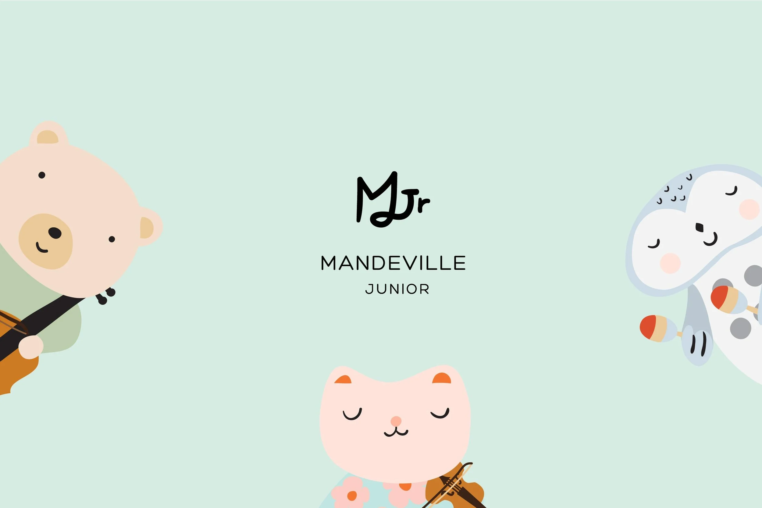
Mandeville Junior. To further strengthen the brand identity, Mandeville Junior was introduced. MJR’s logo was designed witht he M connecting the J to form a musical note. The rounded typeface was also chosen to express a welcoming and nurturing feeling.
The Parent & Junior Brand
Their parent brand, was revived by taking elements from their earlier branding.
We kept the brand mark from their old logo and selected a typeface that is more modern for their brand. The new branding offers an unobtrusive look and feel, ensuring that the parent logo stays relevant in today’s context.
To further strengthen the brand identity, Mandeville Junior was introduced—
for they offer classes as a pedagogy for children as young as 2 year-olds to begin
their musical journey. The brand experience serves to foster gentleness in all aspects of early childhood development. Pastels were selected as colours to connect with the junior brand as they evoke feelings of openness and relaxation where these are qualities are essential in a nurturing and learning environment.
The articulation of the brand was further developed through the introduction
of 3 main characters— A cat, bear and an owl for children to identify with and make their musical journey a lively one filled with inspiration and aspirations.

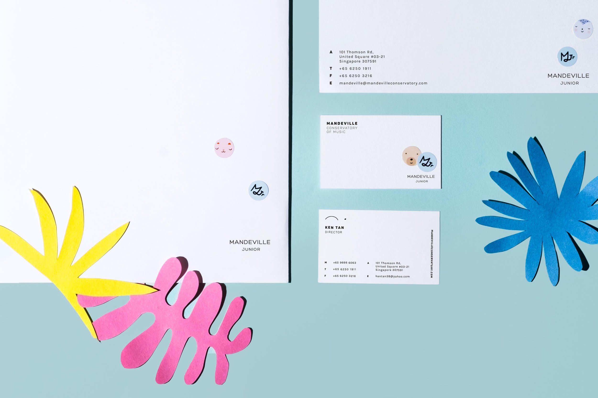
Letterhead and collaterals design. To marry both the brands on their collaterals characters and secondary logo were made into stickers for anyone to apply onto the letterhead to make it fun and to convey a childlike sense of wonderment and to distinguish both brands at first glance.
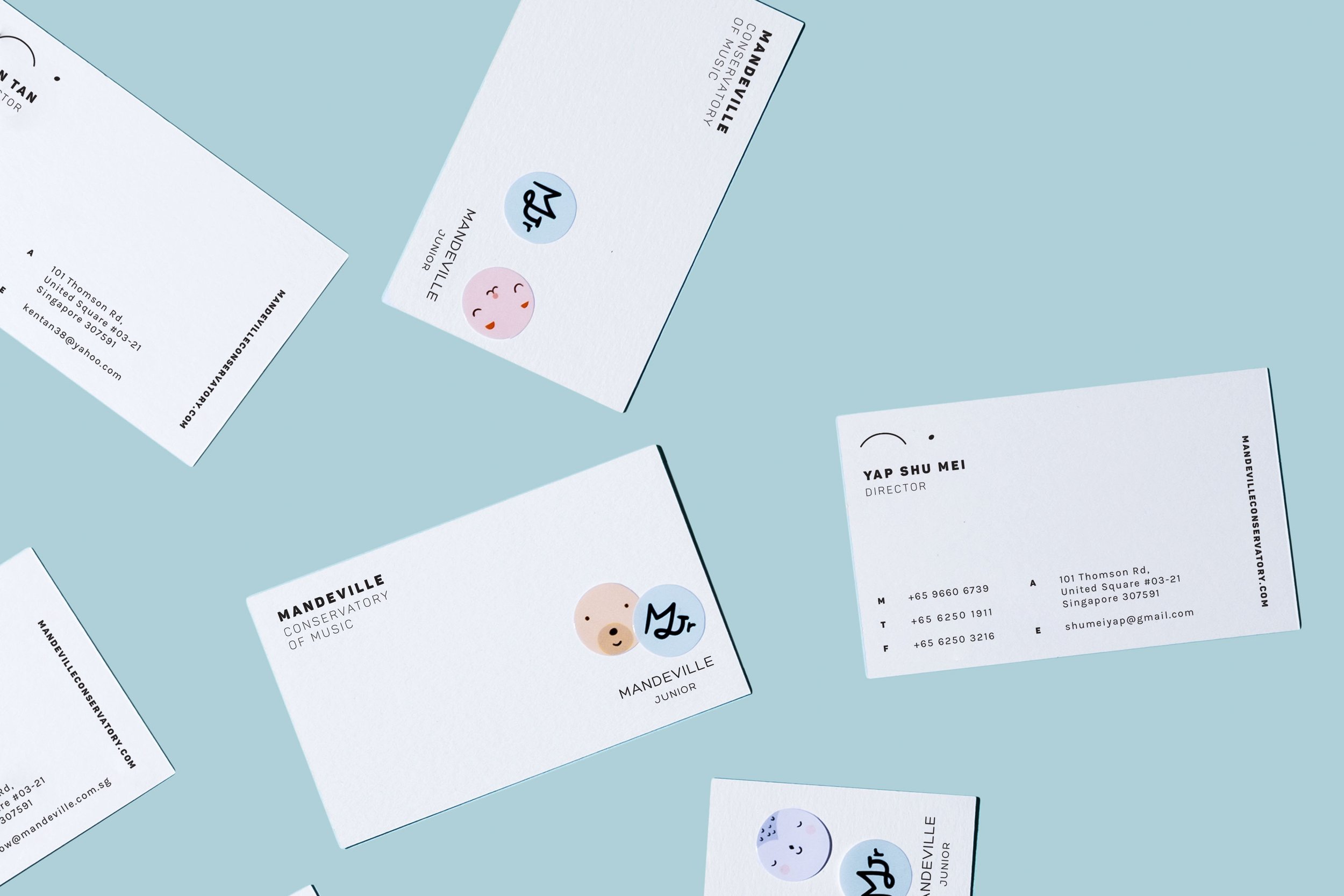
Namecards design. Name cards were also similarly designed to reflect that brand system.

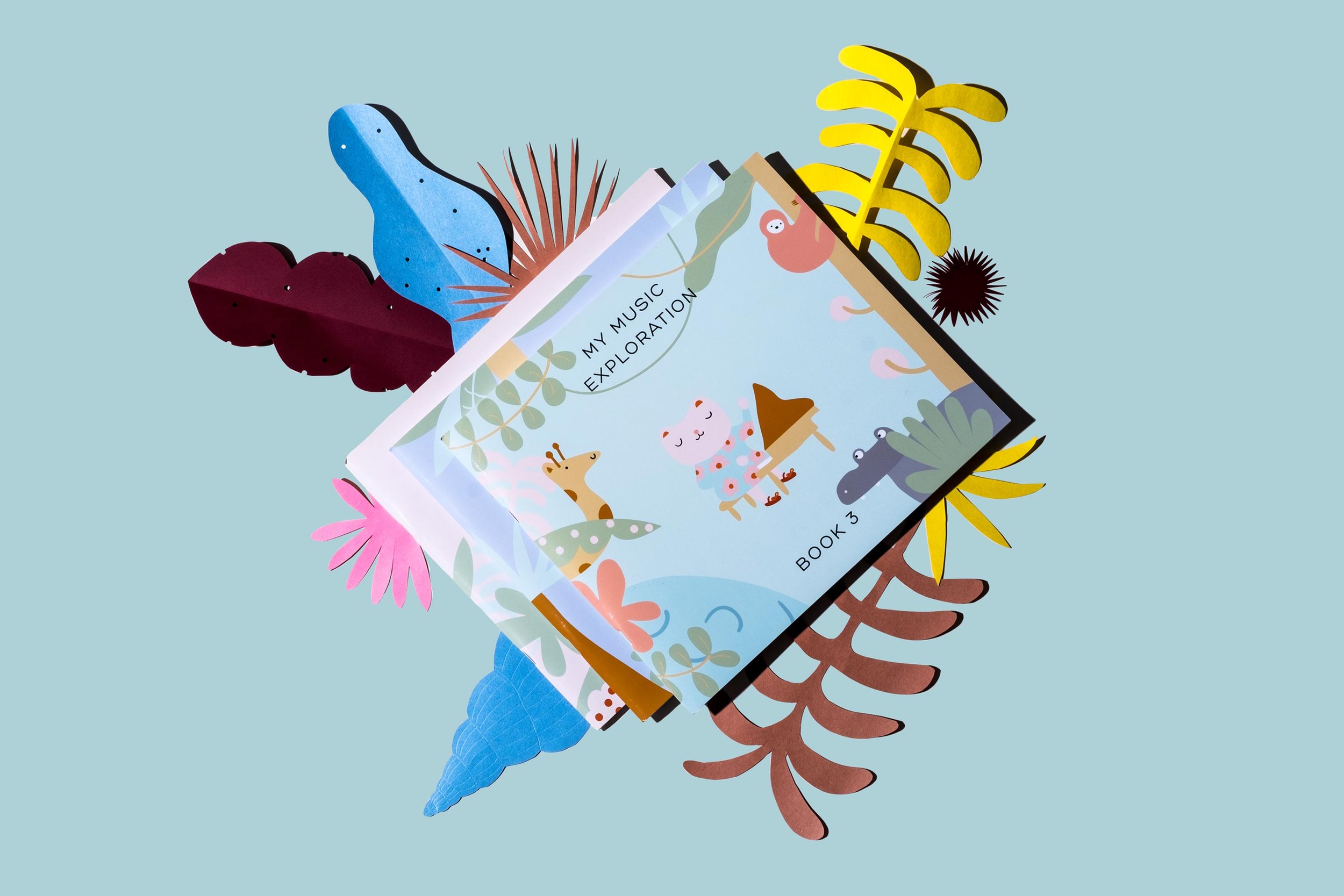
Music workbooks. Three volumes of work books were also designed and conceived for the school to distribute to their students as they embark on this learning journey. The characters and illustrations were all designed from scratch as part of the entire branding effort. Fun activities like tracing, sticker sheets were all part of the design.
Closer look at activity page. This page features a blank illustrated page where children can turn to the sticker sheet at the back and create the aquarium to their own artistic expression.


