Key Message
Uncover the fascinating story of Georgette Chen—the trailblazing Singapore female artist and educator—whose cosmopolitan life experiences led to a significant influence on her works and the
Singapore art scene.

Defining cosmopolitan. Dissecting what cosmopolitan means in Georgette’s art. Throughout her early life to later career, what were the subjects that were symbolic in her art practice.
Concept
Bringing Georgette Chen’s artistic identity to life
through East meets West.

Who is She?
Georgette Chen (1906—1993) is a key figure in the development of modern art in Singapore and was widely recognized for her achievements as
an artist and contributions as an
educator.
Georgette Chen’s signature. Top row features her signature in horizontal format, typical of the western style. Bottom row shows her later works when she came over to Nanyang features her artist sign-off in the chinese vertical writing system.
Inspiration
To marry the influence of East meets West,
I surveyed her early works versus her works when she came over to Nanyang. In her early works, she signed off with her name horizontally in typical Western style.
However, in her later years, she started signing off her name vertically—in a way that is reminiscent of Chinese vertical writing which gave me the inspiration for her
exhibition identity.

Typography Design
A typeface was designed for this exhibition to give it a unique identity and also to reflect how special and one-of-a-kind Georgette Chen was during her time. This typeface lends its inspiration from commercial signage of the ‘60s and ‘70s,
I wanted to create geometric characters that were loud and bold for the exhibition’s visual identity.
Customised Typeface. I studied many visual features of signboards during the ‘60s and ‘70s which exuded a certain character and these commercial signs were striking in broadcasting their businesses. These signage were also unique to Singapore and Malaysia. The above typeface was constructed and designed as a result of these influences.
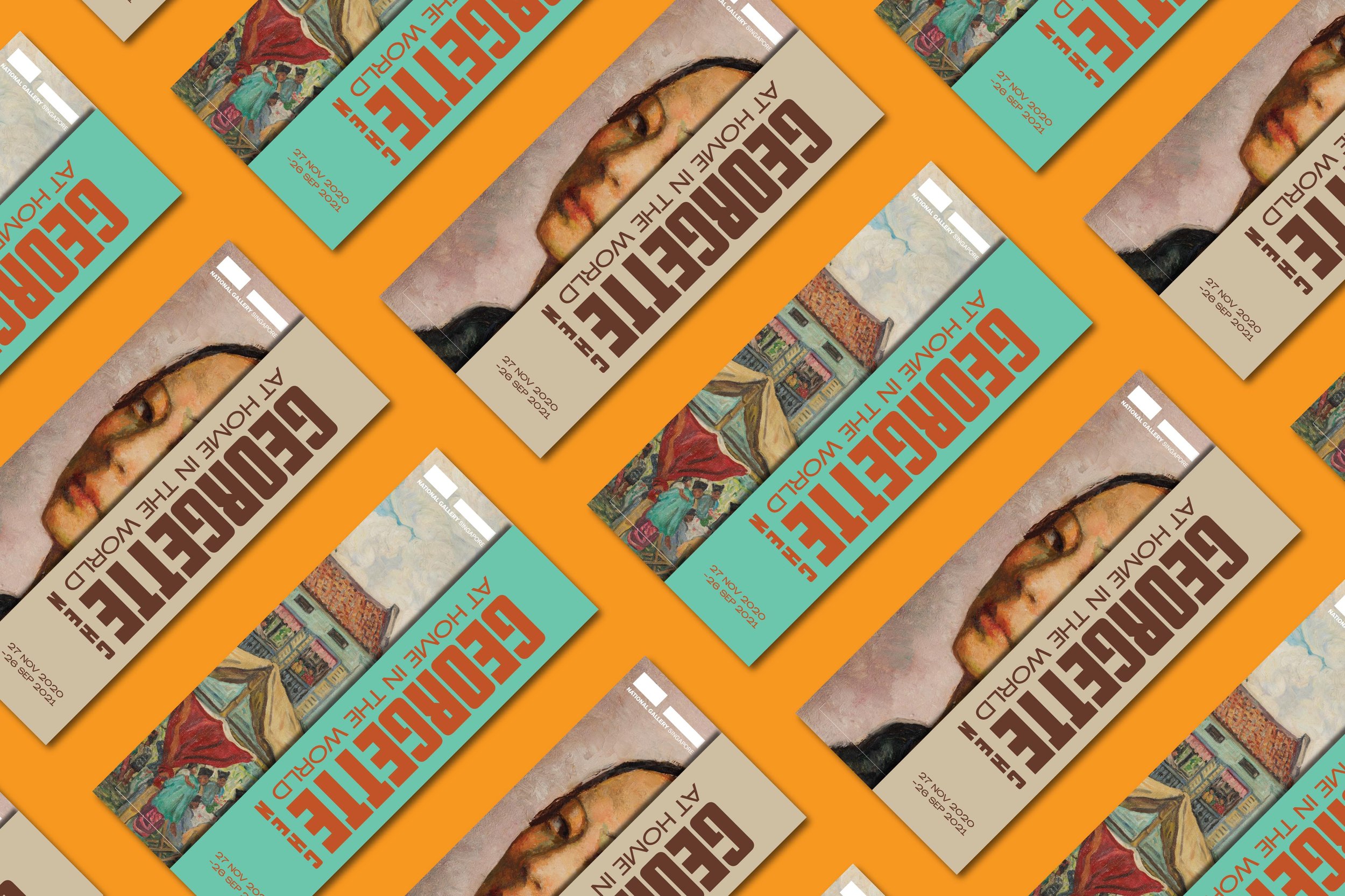
Exhibition Narrative, Logo and Colours
The exhibition narrative and user experience imagined by the curators plays a huge role in understanding the rationale behind the logo and colours of the Georgette Chen’s exhibition visual identity.

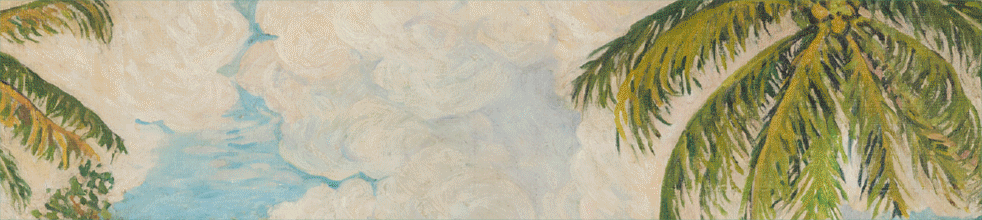
Exhibition flow. Her works were segmented into two time periods of her artistic career. The visitor navigates through works created when she was in Hong Kong and Nanyang (later years) to her works created when she was in Paris (early years).


The key colors chosen for this exhibition were carefully chosen to represent the different periods of her artistic journey—muted brown palette for her time in Paris; tropical green and orange for her time in Nanyang. As a visitor walks through explores her work, they can sense a shift from vibrant to a more restraint vibes.
Logo and Colour Palette. The logo exhibition identity is designed to convey the concept of East meets West. With her english name and exhibition title typeset horizontally whilst her Chinese surname is typeset vertically.
As an artist, her varied experiences were an amalgamation of the West and the East. With that, I sought to marry this concept by typesetting her surname “CHEN” in the way she signs off which is also very prominent in how Chinese characters are vertically typeset whilst juxtaposing this against her English name “GEORGETTE” and exhibition title “ AT HOME IN THE WORLD”. It is also applied in two colour ways to convey the two time periods where Georgette Chen created works of significance throughout her practice.


Exhibition Key Visuals Artwork images were carefully selected to represent the show. The concept of the two time periods were used and applied across all touchpoints in the gallery as well as paid media advertisements.
The exhibition brochure is also designed so that a visitor can read from front to back or back to front. The colours and information flow and layout are also carefully considered to reflect a seamless transition between the two time periods.